
| The votes for the Uncharted Waters book cover are in! Ninety-four people weighed in—47 selecting the porthole, 47 choosing the chart. Over 58% percent of women voted for the porthole, 70% of men preferred the chart. The art/the science. The right brain/the left. The porthole/the chart. Several readers asked about the target audience. According to the marketing expert on the publishing team, the book will appeal to men and women over the age of 30, particularly |
boaters and outdoor enthusiasts. I am told because the book blends humor, adventure, inner reflection, and environmental information, comparable books include Bill Bryson’s Walk in the Woods, Cheryl Strayed’s Wild, and Keith Foskett’s Balancing on Blue.
So, now what?
I received excellent feedback on both covers, comments I intend to share with the designers. However, the ability to address these two critical observations could be the tie-breaker.
Porthole: Many found the subtitle, “Romance, Adventure, and Advocacy on the Great Lakes” too difficult to read. Since the subtitle describes the book, this is NOT GOOD.
Chart: Several women thought the caliper resembled a medical instrument used in surgery. This, too, is NOT GOOD. We will need to find a different navigational tool if we use this cover.
Like the majority of women, I voted for the porthole, Rubin for the chart. And while we bet a buck on the outcome of the vote, since it’s a tie, no money will exchange hands. That’s probably a good thing.
Thank you so much for joining me on the journey! If you’d like to read a few of the many thoughtful comments I received in addition to those posted following the February 1st blog, see below.
Additional Comments from Readers
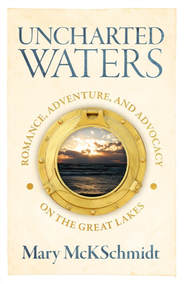
- The one with the porthole sucked me right into the water. The water message was clear but I quickly noticed the words: romance, adventure and advocacy on the Great Lakes. It felt like a book about water but with aspects that would appeal to me even if I wasn’t a boater. “Gee, I’ve seen the lake, book sounds interesting. Think I’ll pick it up to read at the cottage this summer.”
- Well, I know who picked which in your household as the same was here. I like the one with the pic and he likes the one with the map. However, . . . that did change when I pointed out that the nautical measuring device looks like a medical instrument used on women. He screamed “OW!” Just saying . . .
- Porthole more engaging and jumps off the shelf. It is the brighter color and special focus that grabs me.
- I’d go with porthole. Though I don’t think people will think too deeply about it, your chart is about explored and documented waters, hardly uncharted.
- Porthole! The instrument on the chart cover looks like forceps! If you re-work the chart cover without the instrument, I’d prefer that one.
- We both like the porthole. It shows water and makes us eager to “open” it!
- My husband likes the porthole better because he can’t identify the shoreline as a Great Lakes shoreline. (It is the northern coast of Lake Superior.)
- I like the chart, but the porthole would grab one’s attention at the bookstore!
- The porthole is more pleasing to the eye.
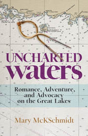
- Chart has more pizzazz
- While I love the sunset photo in the porthole, the chart just grabbed my eye more. I walked away and relooked at the screen, and still the chart catches my attention. Maybe it is because I’m a skipper and nautical charts fascinate me? But I do feel the content of the book stands out more on the chart.
- Chart peaks my interest as I can read quickly what the book will be about. The porthole cover, one has to read around the porthole, thus taking more time.
- I LOVE the porthole, but it is the bolder color of the sub-title that would get my attention on the cover featuring the map. The porthole invites me into a special (secret?) adventure, and I like the clean simplicity of the cover. That said, the chart TELLS me more about what the book is about: Romance, Adventure, and Advocacy (which is WHY I would be inclined to buy the book!) . . . and I missed that important sub-title on the porthole cover.
- I like the chart because I am a map and chart guy.
- I like the rough edges of the coast. Seems more mysterious. The porthole is lovely but it’s crisp and clean-no mystery.
- I vote chart. Gives me a feeling of being in charge rather than below deck looking out.
- I like the chart. To me it reflects the unknown of what lies ahead more than the porthole.
- At first, I liked the porthole because of the image of the water. However, the more I looked at it, the less I liked it. Mainly because it seems too perfect. The chart has less emotional pull although the instrument lying on it is intriguing. Overall, I would vote for it because it speaks to the title and has a little intrigue to it.
- I like the chart. It says (to me) travel and adventure.
- The chart, since I am a sailor.
0 Comments